Have you ever designed a project with the perfect shade of blue on your screen, only to have it print out as a disappointing purple? This frustrating disconnect between digital displays and physical prints is a common problem, but it doesn't have to be your reality. The solution lies in implementing robust color management systems, a professional framework designed to ensure color consistency and accuracy from the camera or computer screen all the way to the final printed piece. By embracing this system, you are not just hoping for good color; you are engineering it, guaranteeing that your creative vision is translated faithfully across every medium.
Why Digital Colors Deceive You
At the heart of the color consistency problem is a simple fact: every digital device speaks a slightly different color language. Your monitor, your smartphone, your digital camera, and your printer all interpret and display color values in their own unique way. This is due to differences in technology, manufacturing, and calibration. A monitor creates color by mixing Red, Green, and Blue light (RGB), which has a vast range of potential colors, known as a gamut. A printer, however, creates color by layering Cyan, Magenta, Yellow, and C-Key Black ink (CMYK) on paper, a process with a much more limited gamut. Without a bridge between these different color languages, colors will inevitably shift, leading to costly reprints, client dissatisfaction, and a erosion of professional credibility. This isn't a minor glitch; it's a fundamental obstacle to professional-quality work.
Achieving Predictable Color: The Role of ICC Profiles
This is where color management systems step in to create order from chaos. The core of this system is the use of ICC (International Color Consortium) profiles. Think of an ICC profile as a dictionary that describes the specific color gamut of a particular device. It defines precisely how that device—be it a monitor, scanner, or printer—reproduces color. The process begins with calibration, which sets your device to a known standard state. Following calibration, a process called profiling measures the device's color output and creates its unique ICC profile. When all devices in your workflow have accurate profiles, the system can intelligently translate colors between them, ensuring that the an RGB value on your calibrated monitor will produce the most accurate possible equivalent in the CMYK space of your printer. This eliminates the guesswork and delivers predictable, repeatable results.
Mastering Print: The Core of Printing Color Management
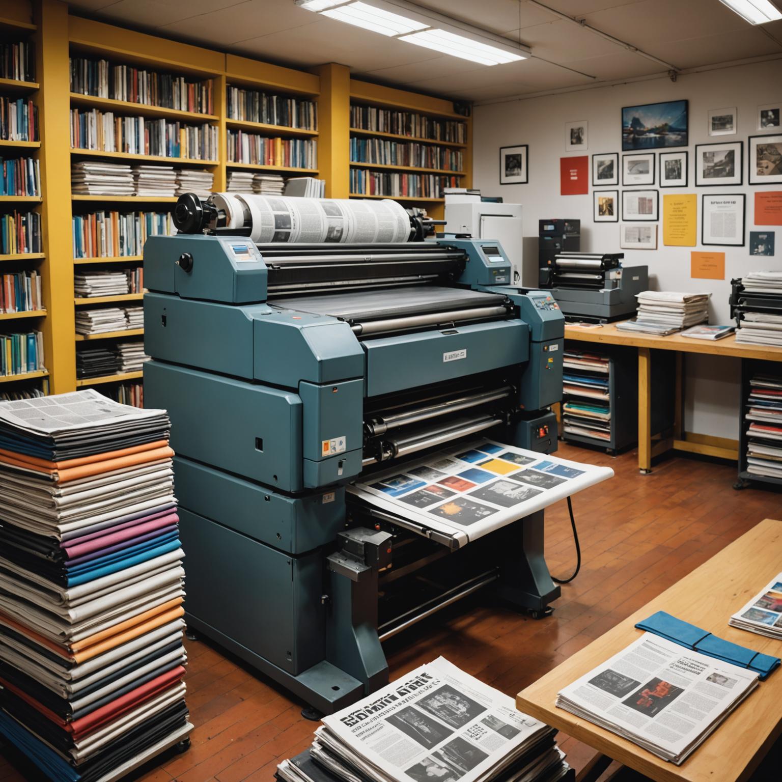
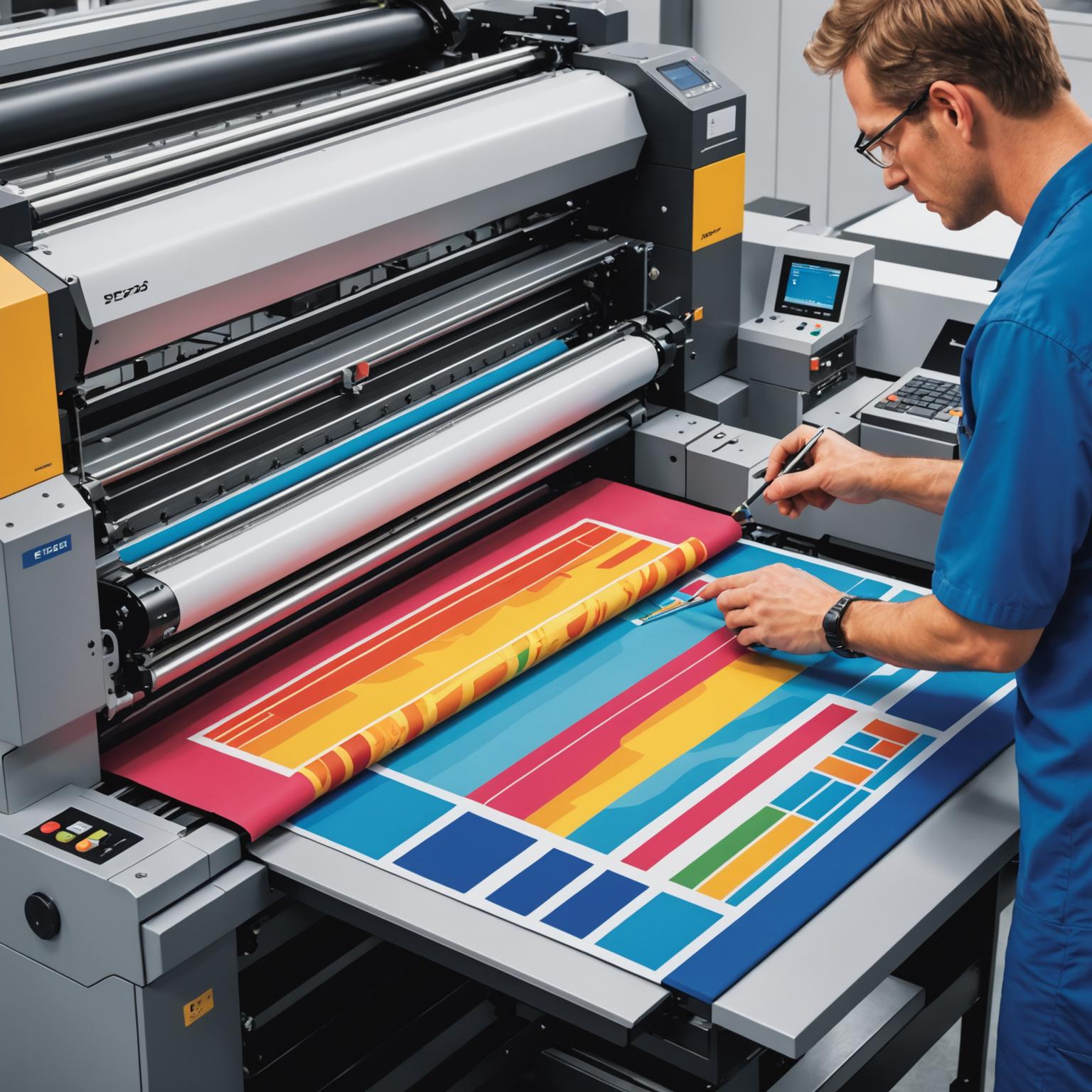
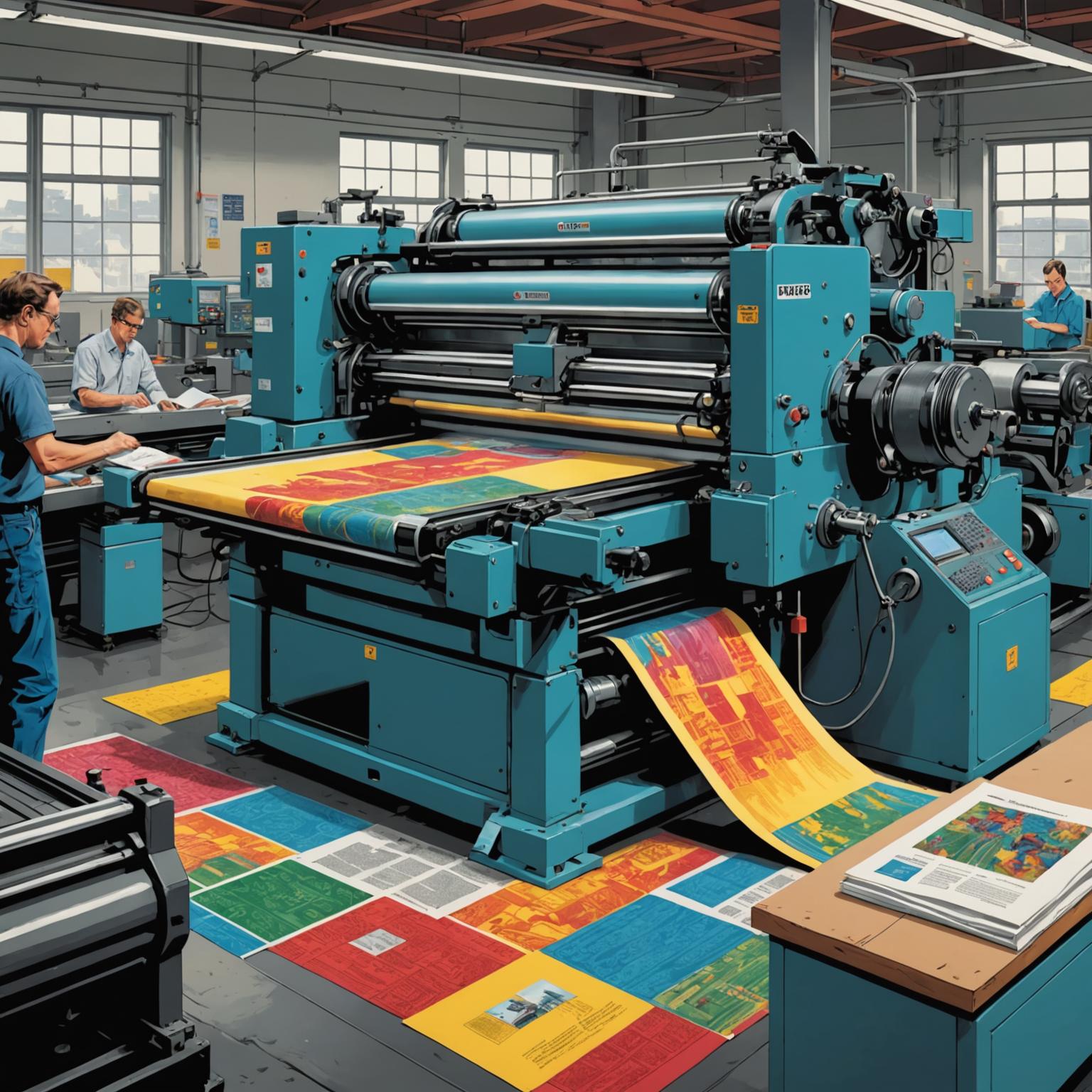
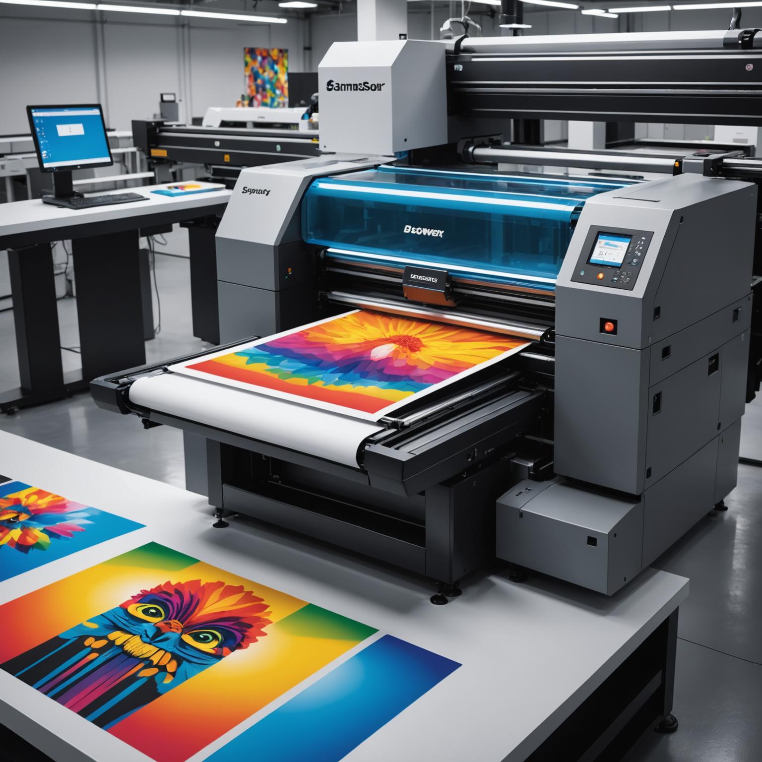
For anyone producing physical goods, mastering printing color management is non-negotiable. This is often the final and most critical step in a creative workflow, and it presents unique challenges. The transition from the luminous, additive colors of an RGB screen to the subtractive, ink-on-paper world of CMYK requires careful handling. Simply converting an image from RGB to a generic CMYK profile is a recipe for dull, inaccurate colors. Effective printing color management involves using the specific ICC profile for the exact combination of printer, ink, and paper you are using. Reputable paper manufacturers and print shops provide these profiles for this very reason. Investing the time to learn and apply these principles will dramatically elevate the quality of your work, save you a significant amount of money on wasted materials, and solidify your reputation as a true professional who delivers uncompromising quality.
Building Your Own Color-Managed Workflow
Implementing a solid workflow is more accessible than you might think. The first and most important step is to calibrate your monitor using a hardware device like a colorimeter or spectrophotometer. Software-only calibration is inaccurate. Your monitor is your window to your work, and if it's not showing you true colors, every subsequent decision is based on flawed information. Once calibrated, configure your creative software (like Adobe Photoshop or Illustrator) to use your new monitor profile and standardized working color spaces like Adobe RGB or sRGB. Finally, when it's time to print, insist on using the correct output profile for your printer and paper combination. This systematic approach is the foundation of professional color control and is a key feature of all effective systems.
Take Control of Your Color Today
Ultimately, color control is about professionalism. It's about respecting your own creative intent and delivering on your promises to clients. Stop wasting time, money, and creative energy on guesswork and preventable errors. By adopting a disciplined approach to printing color management, you move from hoping for a good result to guaranteeing one. Make the decision to take control. Invest in calibrating your display and learn to use ICC profiles correctly. This commitment will pay for itself many times over, ensuring what you see on your screen is precisely what you get in your hands, every single time.